
The Best Bedroom Colours for a Better Night’s Sleep
Being completely honest — who doesn’t want better sleep? With all the stress of daily life (and the ever-grey skies), getting a good night’s sleep is more important than ever.
While we can invest in fancy mattresses and blackout blinds, there’s something simpler that can make a big difference to your sleep quality too: the colour of your bedroom walls. Yes, the right shade can actually help you relax, unwind, and tot up those precious hours of rest. So, if you’re ready to grab a cup of tea and dive into a bit of interior design inspo, here are the top bedroom colours to consider for a truly restful night.
1. Tranquil blues: the classic choice
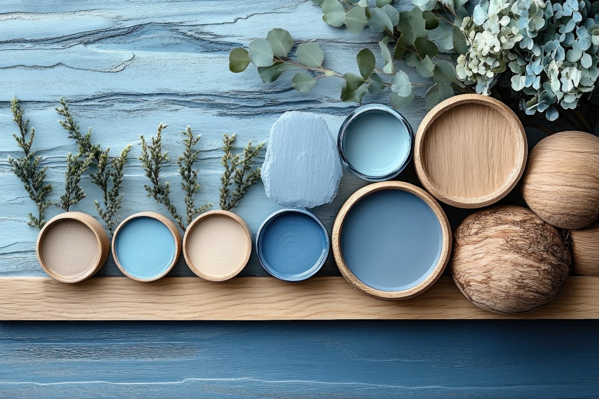
When you think of calming colours, blue is probably the first to come to mind. It’s popular, and for good reason. Soft, muted blues — think sky blue or pastel shades — can create an instant feeling of calm. Studies show that blue helps lower blood pressure and slow your heart rate, which is exactly what you need for a peaceful night’s sleep (1).
Tip for Brits:
Pair it with crisp white bedding or warm-toned wood furniture for a clean, classic look that feels like a weekend escape on the Cornish coast. Just avoid any bold, electric blues, as they can be a bit too energising in a bedroom.
2. Soothing greens: nature’s comfort
Green has this wonderful way of bringing the outdoors in, which is probably why it’s so naturally calming. Soft greens, like sage or mint, add a fresh but understated vibe to your bedroom, creating a restful, nature-inspired sanctuary.
Why it’s brilliant:
A gentle green can help reduce eye strain (2), which is especially helpful if you’ve been staring at a screen all day. It’s a subtle reminder of nature — perfect for bringing a bit of zen into rainy British evenings.
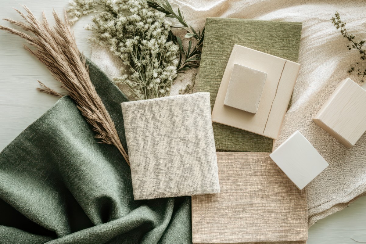
3. Warm neutrals: soft greys, beiges, and taupes

Sometimes, less is more, and that’s where neutrals come in. Warm-toned greys, light taupes, or gentle beiges can be the perfect backdrop for a peaceful night’s sleep. These shades create a calming, minimalist space without feeling too stark or cold.
Top tip:
Go for neutrals with warm undertones to keep the room feeling cosy, rather than cold. Imagine shades like pebble grey or oatmeal beige — soft, inviting, and perfect for layering in textures like wool blankets or velvet cushions for that extra cosy British winter vibe.
4. Soft pinks and lavenders: unexpected but comforting
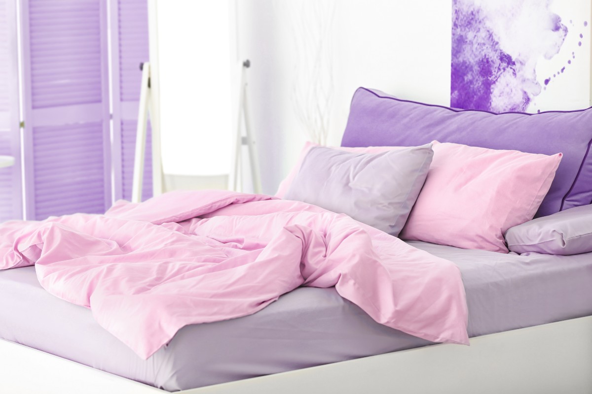
Now, before you scroll on, don’t dismiss pinks and lavenders just yet! When used in muted, dusty shades, these colours can add a surprising sense of calm to your space. Soft blush pinks or pale lavenders are warm and welcoming without being too bold.
Why it works:
Pinks and lavenders can help reduce stress (3), making them an excellent choice if you’re looking to unwind after a long day. And don’t worry, a subtle pink won’t feel too “girly” — it can actually give your space a sophisticated, cosy feel.
5. Gentle yellows: a happy, subtle glow

Alright, yellow might not be an obvious choice for a bedroom, but soft, buttery yellows can give your room a cheerful yet calming appeal. Think shades like warm honey or pale lemon that bring a hint of sunshine without being too bright.
Keep in mind:
You don’t want a bright canary yellow in your bedroom, as that could be too energising (4). Stick to softer shades that bring warmth and keep the space feeling light and airy — especially useful in those darker winter months.
Colours to avoid in the bedroom
Not every colour promotes relaxation, so here’s what you might want to steer clear of if you’re aiming for a better night’s sleep:
-
Vibrant reds – They’re bold and energising, great for living rooms but not so much for bedrooms.
-
Deep purples – While they can be luxurious, rich purples can feel a bit too heavy and mentally stimulating for a restful night for some.
-
Neons – Anything in neon just screams energy. Save all that vibrancy for another room!
Finding your perfect shade
Ultimately, the best colour for your bedroom is one that helps you feel relaxed and at ease. Whether that’s a calming blue, a soft green, or a neutral grey, choose something that makes you feel cosy and ready to unwind. And remember, your lighting will make a big difference, so use warm, soft lights to keep the space feeling snug and inviting.
So, if you’re ready for a bit of a home refresh, grab those paint swatches and start planning your dream sleep space. Sweet dreams!
Sources:

Gemma Henry - Content Lead
Gemma finds sleep fascinating and describes the discovery aspect of her role as eye-opening. Her keen eye for detail and dedication to thorough research ensures that Bensons customers get the informative sleep-based advice they're looking for.